Showing posts with label CAS. Show all posts

Wednesday, November 12, 2014

MSM's Merry & Bright, more or less

I'm playing in the CAS challenge over on SCS again this week.  This week's challenge is "stamp a pad".


I used a technique called direct to paper to create the paint swipes using three shades of blue for an ombre look.  I really do like that pop of black.  That's the more version, only because it has three more sequins!  LOL.


This is the less version.  It's fun to do a more & less version, interesting to see the differences.  I can't make up my mind which one I like better.

Thanks for stopping by!  Have a moo'valous day!

Paper: PTI White, SU! Basic Black
Ink: SC Color Theory (Glass Slipper, Clear Blue, Something Blue)
Accessories: Sewing Machine, Silhouette Cut File, SC sequins (black)
Techniques: Direct to paper, Sewing


Monday, November 3, 2014

MSM's Be Merry

Today's CAS (Clean And Simple) challenge over on SCS focuses on non-traditional Christmas cards. I am taking a class over on Studio Calico called "Send Joy", taught by Lisa Spangler.  This is a CASE of one of three cards she demonstrated, using a cool ink technique!  


This non traditional Christmas card has a trendy vibe with its two toned (blue / green) triangles that serve as evergreen trees.   It is definitely CAS in design, containing white space upon which the eye can rest.

This was a fun challenge using something other than the traditional red + green for Christmas cards or white + blue for Winter Holiday cards.

Thanks for stopping by!  Have a moo'valous day!


Stamps: SC Send Joy
Paper: PTI White
Ink: SC Color Theory (Mint Hint, Lime Light, Emerald City, Inky Black), Brilliance Galaxy Gold
Accessories: Krylon 18 kt Gold Leafing Pen, mini mister (water), foam squares, SC gold sequins & stars, SC craft die O Christmas Tree


Sunday, May 13, 2012

Happy Mother's Day MOM!


FINALLY!  Time to stamp & create a card!  This is the Sale-A-Bration 2012 paper...Everyday Enchantment + matching ribbon + matching brads!  I sponged Soft Suede around each panel & layer for a vintage look.


I even decorated the envelope...sponging ink, stamping and adding an embellished tag.  The tag is adorned with a doily and lace ribbon.  I did not mail this card...I hand delivered it Sunday...before we went to see The Avengers!  whoo hoo.  :-D  My favorite Avenger...IRON MAN! 


Even the inside of the card is adorned!  The image was colored with SU! markers, huffed on & stamped on Very Vanilla.  The panel was sponged around the edge with Soft Suede.  At the top of the panel is lace tape.  It's hard to see...and it looks like magic tape...but it has a white lace design.


I added a counterfeit Washi Tape flag to complete the sentiment.  to my WONDERFUL Mom!


Here's a really good look a the lace tape!  This is the back of the card.  

I hope you had a moo'valous Mother's Day!  I thoroughly enjoyed my day.  Chocolate dipped strawberries, a beautiful card and a gift card + breakfast bar at Ryan's from the hubby...and then movies with Mom and Phillip!  Yup...moo'valous day indeed!

Thanks for stopping by! 

Supplies (all products Stampin' Up! unless otherwise indicated)
STAMPS - Messages for Mom, Fresh Vintage, Family Reunion
PAPER - Everyday Enchantment DSP, Calypso Coral, Pool Party, Very Vanilla
INK - Soft Suede, Basic Black, Poppy Parade, Calypso Coral
ACCESSORIES - Avery Shipping Tag, Wilton 4" Doily, Crochet Trim Victoria 5/8", Cream Envelope, Washi Tape (Targer & Freckled Fawn), toothpick, Everyday Enchantment Brads, Everyday Enchantment 1/8" Organdy Ribbon in Calypso Coral, SU! Markers in Lucky Limeade, Calypso Coral and Poppy Parade.

Friday, September 9, 2011

More Decorated Onesies

Concord Crush & Perfect Plum

Peach Parfait & Cajun Craze
Which one is your favorite so far? 

Thanks for stopping by!  Have a moo'valous day!

Thursday, September 8, 2011

Decorating Onesies

The stamp set I wanted for the inside of the card arrived - SU!'s Little Additions.  Now I can start putting together:

Die cut images from PTI's It's a Jungle Out There.

Onsie die cuts.

Die cut card bases.
Notice each onsie has a different main color.   I had added a sticky note to each onsie noting the coordinating color I wished to use for ink.

First up were the Pear Pizzaz duo - striped and polka dotted.  The paper is from the SU! Designer Series Patterns Pack In Color.


Here's some pics of the steps in creating these two cards...

Choose die cut - I chose the Giraffe.
Choose the die cut and select TWO colors.  The PTI set It's a Jungle Out There is a two step set.  My colors were Garden Green and Pear Pizzaz, a SU! Dynamic Duo!  They sound like Super Heros.  Maybe they are...hmmm...

Stamp the spots in Garden Green.

Stamp the body in Pear Pizzaz.

Image from SU! Little Additions. 
We'll fill in the blanks when the baby gets here!

Envelopes using PTI Bundle of Love.

There will be a bunch in different colors.  I'll post 'em as I get them done...in pairs...complete with envelopes! 

Thanks for stopping by!  Have a moo'valous day!

ETA:  These cards fit in a standard (card) size envelope. 

Tuesday, September 6, 2011

Phillip @ 16

I was looking for some paper to use for this picture and for the upteenth time passed by this SU! Specialty Pack...was I saving it for a "special project"?  HUH?  What's more special than this project?  ;-)


I don't remember the name of this SU! Specialty paper pack, but I used the heavy shimmery copper, the satin stripe Whisper White and the stain stripe Crumb Cake.  I love it!  It really did not photograph well. 

I'm no longer a paper hoarder.  Seriously.  How am I going to enjoy the beautifuf paper when the paper is in a drawer?  I'm not.  Or the pictures while they are in a frame in the closet or an envelope in a box?  I'm not. 

I can now just open an album...and enjoy the pictures for which I handed over a bunch of FRNs AND the gorgeous paper that...well...I had to hand over a bunch of FRNs for, too.  LOL.  Point is...if it's good enough to buy, good enough to keep, find a way to enjoy it.  I think I watched WAY to much Clean Sweep.  LOL.  Nope...I like that show!  The one thing I took away from that show is if you're gonna keep something, honor it.  Place it somewhere you can enjoy it.  Otherwise, it probably needs to go.

Thanks for stopping by!  Have a moo'valous day!

Saturday, August 27, 2011

Phillip is EIGHT!


I love this mix of patterned papers!  The purple is pulled from the moddled background!  Perfect plum!  Yummy!  All products Stampin' Up!  'cept the kid...and the photograph. 

Thanks for stopping by!  Have a moo'valous day!


Thursday, August 25, 2011

Phillip @ 13

A western themed photo...taken at the age of 13.  I dug out some SU! Outlaw DSP, and paired it with some Chocolate Chip and PTI Ocean Tides.  I'm pulling out the "antique green / gray" in the background of the photo as I do not want to compete with the red shirt. 


Green and red are complementary colors - they are opposite each other on the color wheel and they bring out the best in each other. Kind of like best friends! They are high energy colors, but this subdued green doesn't compete with the red. 

Thanks for stopping by!  Have a moo'valous day!


Wednesday, August 17, 2011

Welcome Baby!

I think this one has to be my favorite...just because there were some pleasant surprises on how this came together.


The DSP is Urban Oasis...unopened pack in the drawer.  I never thought it would look good on a baby page until I busted open the pack and saw the REST of the patterns.  This is THREE patterns from the Urban Oasis pack.  The Baja Breeze is a good match for the blue in the picture.  I tried out my new Spellbinders New Arrival Dies I purchased from HSN.  Ho hum...they are supposed to cut (they did), emboss (huh?  really hard to see) and  stencil (yep - use a marker...does a good job).  I just wasn't WOW'd by 'em, ya know?  The baby sure is cute.   Phillip said the stork should be white, not brown...I told him the bird was just dirty and needed a bath.  ;-)  More Tidy Alpha for my title.  I'll fill in the details on the Becky Higgins journaling card.

I think this is a cute baby page...not to overwhelming BABY, but with classic elements.

Whatcha think?

Thanks for stopping by!  Have a moo'valous day!

Tuesday, August 16, 2011

The first year

...photos were taken at 6 weeks, 3 months, 6 months, 9 months and one year.  Today I share 3 months, 6 months, 9 months and one year.  Same layout, different colors.  Enjoy!


You can check out other ages & posts here!

Thanks for stopping by!  Have a moo'valous day!

Monday, August 15, 2011

Phillip is TWO!

If you've been following my latest series of posts, I have been scrapping the formal birthday pictues of Phillip.  You can check out previous posts HERE

Today, I showcase age TWO.  And John Deere! 


Don't you just love that DSP?  It's from the mollymoo store.  Ok ok...ahem...it's counterfeit.  LOL.  Creative Imaginations John Deere stickers...I have...ahem...FOUR sheets of them.  So...I just randomly attached stickers to a 12 x 12 piece of Whisper White! 

For this layout, I omitted the 2 inch strip that is usually on the 7 1/2 inch panel...why cover up all those nice John Deere images?

The "O" looks off...but it's not...maybe it should be off so it would look straight?  I dunno...but it's straight.  I used a ruler. 

I hope you are enjoying the series and will be inspired to scrap your own formal photos after they have been enjoyed hanging on the wall...you can then open your scrapbook and enjoy the pictures AND your DSP / embellishment stash.  ;-)

Thanks for stopping by!  Have a moo'valous day!

Sunday, August 14, 2011

Phillip is FOUR!


Very rarely do I buy a non-SU! paper collection and buy the whole nine yards!  I love this Basic Gray Archaic collection...I purchased the fibers, the chipboard, the rub-ons and the whole 12 x 12 paper pack.  I even purchased the 6 x 6 paper pack.  Told ya I had it bad.  LOL. 

I have a few sheets of the 12 x 12 paper pack left.  That's OK because I get to look at and ENJOY that beautiful paper and the pictures I have placed on that paper. 

Sometimes it's hard to pair up non-SU! paper with SU! colors...best thing to do is go for coordinating colors.  In this case, the best colors from SU! were Always Artichoke and Bordering Blue.  And yep...that "f" and "o" are stuck on the picture.  LOL.  And I have no problem with it.  ;-)

Thanks for stopping by!  Have a moo'valous day!

Saturday, August 13, 2011

Phillip is SIX!

And I love Blues Clues!  I found a clue!  I found a clue!


Let's get out our handy dandy notebook...ah.  I found the Blues Clues print on the Nick Jr website!  I paired it up with SU! Night of Navy & Pacific Point.  (sigh)  What can I say...I love Blue! 

Did you watch Blues Clues with your kiddo? 

Thanks for stopping by!  Have a moo'valous day!


Thursday, August 11, 2011

Phillip @ 12

Just graduated from elementary school!  No not recently...but back in 2006.  I'm taking a trip back down the memory lane this week scrapping the annual formal pics of my son, Phillip.


Same layout, different papers, different photo, different look and feel.

This is a combination of DSP from SU! Ski Slope and Tall Tales.  I was pulling my colors from his necktie.  I didn't not want more black as a dominant color, nor did I want to compete with the red.  The tie has blue, soft yellow & brown as well as black with white stripes.  I chose the soft yellow and the chocolately brown.  I had no idea what to use for my third color.  Then I rememberd a DTGD challenge on SCS to "fall back on black".  As an accent, the black worked out well.

I decided to use SU! scallop trim border punch on the black strip to give it some punch.  LOL.


The focus of these pages is the formal picture.  All the pictures have a different feel and I liked the layout so much, so I chose to use the same layout for each picture.  I love digging through my DSP stash.  It feels GREAT to be using this stuff! 

Thanks for stopping by!  Have a moo'valous day!

Wednesday, August 10, 2011

Phillip @ 14!

This was the last formal picture made while he had his braces. 


I asked Phillip what colors would go good with this black & white picture...um...black & white, he said.  LOL.  I added the pop of Pacific Point!  That DSP is a specialty pack...I think it's actually a Halloween DSP pack.  The name is Night & Day. 

I busted out the new lace border punch.  I know...lace on a boy page...but this doesn't look girly at all! 


This has to be my favorite page so far. 


I just love the elegance of a black & white photo...but it's a casual pose...and one handsome young man!


Same layout as Monday and Tuesday...different papers, different pictures, different looks.

This is fun!  Thanks for stopping by!  Have a moo'valous day!

Tuesday, August 9, 2011

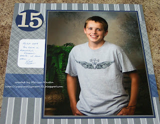
Phillip @ 15!

Oh my goodness.  I about cried after I got this one done.  I guess I hadn't had any time to ENJOY this picture.  But I do now.  See...


I found the perfect place for it to hang on the wall of my stamp room / office / game room / tv room. 


Same layout as yesterday...but all patterned paper from SU!'s retired Prestwick.  Numerals are SU! Timeless Type chipboard.  I did add a Becky Higgins journaling card to this one, tucked under the photo. 

Thanks for stopping by!  Have a moo'valous day!

Monday, August 8, 2011

Phillip is FIVE!

I'm getting up my courage to scrap all those formal 8 x 10 pictures from each birthday!  Here's number FIVE!


I've now created the first page for his baby book.  LOL.  It wasn't too bad.  I used glue dots to adhere the picture to a Night of Navy mat and then double matted with Early Expresso.  I love how the Early Expresso brings out his dark brown sparkling eyes.

This layout was scraplifted from a page by Mary Larson as shown in Creating Keepsakes, a treasury of favorites.  I die cut the title from SU!'s Simple Letters Alphabet.  There might be journaling in the blank Soft Suede section under the title...then again, there might not. 

It's very clean & simple.  I wanted to make the photo the focal point of the page...as it was the whole point of the page.  LOL. 

It feels good to be starting on this.  I've thought about it for a long time.  I want to look at these & enjoy these when I'm in the  mood, not look at the box they are stored in. 

Well...thanks for stopping by!  Have a moo'valous day!

Saturday, July 23, 2011

Quick Thank You

Just a quick post to show ya a quick thank you.

I am making thank you cards for ny niece's baby shower...I already had an idea in my idea book...then I hopped over to Nicole Heady's blog to check out the Stamp-A-Faire posts...and saw THIS challenge.


Clean, simple & quick!  Plenty of space for a personal note to be written inside. 

This was NOT my original plan, but did I mention, it was clean, simple & quick.  LOL.   I'm using supplies on hand - my new PTI Text Style Big & Bold Wishes and my new SU! Nursery Additions. 

Thanks for stopping by!  Have  moo'valous day!