Tuesday, June 23, 2009

The Run for the Water - Revisited

I just had to dress this page up!

What page? This page.

I tried the matchy matchy thing and was not happy with it. So, I gave the coordinating thing a try. AND dressed up the page.

This what I came up with...

I used my SU! Big Shot and Top Notes Die to create a journaling block. Journaling is done on strips of distressed and edge inked So Saffron cardstock. The primas and brads are from my stash. I changed out the pink buttons for cream buttons. I stamped my title using SU! Taken with Teal Classic Ink and SU! retired Tidy Alphabet; ran through Xyron and attached. Felt flower was in the Stampin Flybabies Spring 2009 craft kit as was the designer paper.

With this revised page, I was able to use the title I originally wished to use.

What lesson did I learn? Coordinating is definitely better than matchy-matchy. I do like the simplicity of the first version, but not the not so matchy-matchy pink color in the title.

SUPPLIES:
Paper - Making Memories Flower Patch, SU! So Saffron
Ink - Taken with Teal
Stamps - Tidy Alphabet
Accessories - SU! Big Shot, Top Notes Die, Making Memories Flower Patch Collection buttons and felt flowers; brads, Prima flowers, Making Memories distresser, Xyron

Monday, June 22, 2009

Grandma's Favorite Color

...is purple. Mine is green! I love the new Zinna Collection from The Little Yellow Bicycle. Diane selected this collection to be featured in the Summer 2009 SCS Stampin' Flybabies Craft Kit! I liked it so well, I went and bought MORE Zinna Collection items! I knew I wanted to scrap the pics of Grandma's 60th birthday celebration using these papers. Might scrap my wedding as well. Need more papers...

Here's my first page using items from this kit.


Looking at it now...not sure I like those purple pearls...oh well....it was a doozy making this page. gosh. Notice that the paper had a definite up and down? The page was supposed to have the pic and journaling block at the bottom. See that bird in the middle of the page? He was UPSIDE DOWN! Holy cow. So I very carefully destroyed my picture in my attempt to remove it...I use sticky strip. OY! Better to destroy a picture I CAN reprint than a precious DP style I only had ONE sheet! I reprinted my picture and remembered to flip the layout 180 degress. Much better.

My favorite part about this layout is...look at the pattern on both pieces of DP...they are exactly the same, just in different colors! Sally (Salster) on SCS had the perfect sketch...SBSC115.

Love that picture of Grandma & Phillip. Phillip is the only great-grandson for Grandma and Granddad. The rest of 'em are girls!

Supplies:
Paper - The Little Yellow Bicycle Zinna Collection
Accessories - The Little Yellow Bicycle Zinna Collection, sticky strip, paper snips

Sunday, June 21, 2009

I'm "Taken with Teal"!

I'm using up the last bits & pieces of the SCS Stampin' Flybabies Spring 2009 Craft Kit. I have thoroughly enjoyed the Making Memories Flower Patch Collection.

I decided to dive into some "old" pictures (film / developed; not digital) for this next layout.


That's my brother & me. Easter 1981. Mom is quite a seamstress. She made that dress; it was one of my favorites. Boy, my brother is shorty shorty in this picture! Haha...today, he's half a head taller than me. WOW! This was created using Sketch #1 from 52sketches52weeks.


Me & My Dad was created using Sketch #24 from 52sketches52weeks and with some remaining Making Memories Flower Patch collection pieces from the Spring 2009 SCS Stampin' Flybabies Craft Kit. This is the first time I used my SU! Circle Scissors! I LOVE THAT THING! It cuts like a knife in warm butter.

This page uses elements of the Art Deco style. The top half and the bottom half are symmetrical. Kind-a-sorta mirror image...but it's there!

Love those flowers? I created those using SU! Scallop Circle Punch and paper snips! The centers are 1 1/4" circles attached with SU! Stampin Dimensionals. I love that ribbon; had it for quite a while and am thrilled to be using it up. There's quite a bit of ribbon on a $1 roll from Michaels!

DH took those pictures of dad & me. HAPPY FATHER'S DAY DAD! I LOVE YOU! We're gonna meet Dad at Grandma's and take him out to eat for Father's Day!

I might just frame this page.

Both pages feature SU! Taken with Teal textured CS and the daisy ribbon from the Michael's $1 bin. Also featured is my "go to" stamp set for titling - SU! Tidy Alphabet (retired).

Easter 1981
Stamps: Tidy Alphabet
Paper: Taken with Teal, PTI White, Making Memories Flower Patch
Ink: Taken with Teal
Accessories: Corner Rounder, SU! Spiral Punch, Making Memories Distresser, Big Shot, Top Notes Die, sticky strip, SU! Stampin Dimensionals, Michaels $1 ribbon

Me & My Dad

Stamps: Tidy Alphabet
Paper: Taken with Teal, PTI White, Making Memories Flower Patch
Ink: Taken with Teal
Accessories: SU! Circle Scissors, SU! Scallop Circle Punch, Cutter Bee paper snips, 1 1/4" circle punch, SU! Stampin' Dimensionals, Michael's $1 bin ribbon
Techniques: Punch

Friday, June 5, 2009

JLO Inpsiration Challenge #2

On Mother's Day, we went to see E.T. at the Historic State Theater in Elizabethtown, KY. The State recently completed several years of restoration and renovation. It is now open. You can learn more about the Historic State Theater HERE.


The Art Deco style was prevalent between 1920 and 1939. It is sandwiched between the two World Wars. The Art Deco style is characterized by:
  • angular, symmetrical and geometric designs. In the State, the stage is flanked by two greek goddesses; one holding the mask of tragedy, the other comedy. The theater is a mirror image of itself, if you just put that mirror right down the center of the auditorium.
  • stepped forms, sweeping curves, chevron patterns and sunburst motif. The State has sweeping curves in it's decor. You can see this in the murals on the side walls and in the relief sculptures on the ceiling. In the picture below, you can see the stepped form in the design of the walls on the outside of the theater.


  • bold colors. The State is painted in various shades of green and burgundy. Other colors characteristic of the Art Deco Style are yellow and torquoise.
  • non-traditional materials. Art Deco Style includes the use of materials such as aluminum, marble, glass, stainless steel, plastic and/or inlaid wood.

Here is a description of the State Theater, from http://historicstatetheater.org/history/

Fronting on Dixie Highway, the theater is one of the few remaining examples of Art Deco architecture in Hardin County. The building is constructed of brick in a common bond pattern. Significant features are the large marquee, neon signs and stepped roof parapet which are typical features of the Art Deco theater architecture of the late 1930’s and 1940’s.

The front facade includes in-laid geometric designs, which surround and emphasize the grand vertical marquee tower. Carrara glass accented portions of the front façade such as the ticket booth on the right of the building and the store-front style window on the left.


###

Your challenge, should you choose to accept it, is to play along with the JLO DT and create something with JLO stamps inspired by the Art Deco Style. There's no time limit. If you don't have any JLO stamps, why not check out the FREE Brentwood digi stamp?

If you upload your project to SplitCoastStampers, use keywords JLOIC02 (JessicaLynnOriginal Inspiration Challenge 02). Additional keywords for this project could be Brentwood and/or JessicaLynnOriginal.

I'm looking forward to seeing your creations!

Thursday, June 4, 2009

Happy Anniversary!

Today is my 10 year wedding anniversary! WOW! Ten years with DH! He's one lucky man! Ok...I'm a lucky woman!

Reckon if I get some scrapping time in this weekend...wanna see me scrap some wedding pictures? I may just break out some new papers from The Little Yellow Bicycle!

When Karen & I first got to know each other, we were both delighted to learn we share the SAME wedding anniversary. Later this year, I'll tell ya what OTHER important date we share. Mom's positive Karen is not my sister. Reckon Mom would know.

Happy Anniversary to Karen and Tom! You can visit Karen HERE!

Pay Attention to ME, Mom!

I was trying to photograph my layouts on the Historic State Theatre. T-2 had other ideas!


I'm still mixing patterned papers...this one is botanicals and flourishes. This sketch is from 52sketches52weeks. The doodling is my own...with a gel pen. Scary stuff! But it's kind of fun!

Wednesday, June 3, 2009

Cousins

I've had this picture on my bulletin board for years. It's a professional photo of my niece and my son taken almost 13 years ago. My niece is three years older than my son. They look the same size in the pic.

I saw this "Cousin" layout in the May/June 2007 edition of Scrapbooks, etc. Yep, I have some old magazines that I look at when that particular month rolls around again. It seems like I enjoy them more when they are ONE year old. The products have been around a bit longer and have reached all areas of the market. I still love NEW stuff; but I'm not enabled. By the time a year has passed, I have decided which "new" stuff is "ME" and am not purchasing stuff because it's "new".
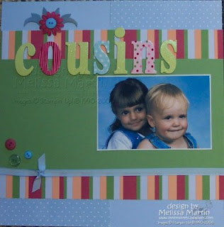

This is another page created during the 101 Days of Summer VSBN on SplitCoastStampers. Valerie - awjmgmom - challenged us, with 101DOSF, to be inspired by "Beach Balls, Towels & Cool Blue Water". We had to use the following elements: Circles - to represent beach balls; Stripes - to represent beach towels; Something transparent or a cool shade of blue - to represent the crystal clear waters of the beach.

My circles are in my buttons, the dots in the "S" and the "N" in the title and the polka dotted DP. My stripes are in my striped paper and the "O" of the title. The ribbon also provides a striped element. I love the SU! taffeta ribbon! We had a choice on the third option, I chose the blue - in my background DP, in my ribbon, in my button colors and even in my picture.

I love the chipboard flourish, flower and button embellishment. I painted the chipboard with gesso, smooshed on SU! Bashful Blue craft ink, versamark and SU! Clear EP. Not all at once...but in different stages.

I love this picture; precious and innocent. I probably should frame this page. I have another wallet photo I will add in the blank space beside the other photo.

I cannot believe my niece is graduating from high school on Friday. It seems like yesterday, she was dumping my shoes out of the shoe boxes in two neat piles...one of shoes and one of boxes. I hear she has become a responsible young lady, completing high school with an almost full time job. She received a scholarship to go to nursing school and also wants to study horiculture. I haven't seen her in almost four years. I wonder what she looks like. I think she's tall & skinny like her Daddy and has her mother's face. I reckon I'll find out on Friday. DH is renting a limousine and we're all going up to Louisville in style!

SUPPLIES:
Paper - SU! Bashful Blue, SU! Darling Doodles, SU! 6 x 6 prints pack
Ink - SU! Bashful Blue craft, Versamark
Accessories - SU! Bashful Blue taffeta ribbon, Clear EP, chipboard letters, chipboard flourish, prima, SU! buttons, miscellaneous buttons, glue dots, sticky strip, heat gun, gesso

Tuesday, June 2, 2009

Patch Sewing Boy Scout

One busy evening...

When you work a public job, when are your evenings NOT busy? Fixing supper, doing chores, getting ready for tomorrow...

One busy evening, DS wanted to SEW! (sigh) It was 7 PM and he wanted to sew his patches on a towel. I had other ideas for his patches...but I wasn't ready to do that just right now. (sigh) Then I thought...what could it hurt. I mean...he can sew...he wants to sew...they are his patches. I did lay them out and show him where to put them so that they all fit on nicely. But he did all the sewing. And he did an excellent job. He can wind bobbins and thread needles. He don't quite have the hang of threading the machine, but he's getting there.

I'm glad I took the time...cuz every night is a busy night. Not too many of them that you get to see your DS sewing!


All supplies are Stampin' Up!, except those Prima Flowers. The Good Morning Sunshine DP and the corduroy buttons arrived Friday! Love those buttons. That solid CS is Summer Sun; Summer Sun is supposed to be the color in the DP. That CS is an off color Summer Sun...actually, I think the DP is too light of a "Summer Sun", as the CS matches the Summer Sun in the 12 x 12 sheet of DP and not the strip on the right.

Stamped journaling lines with SU! retired Journaling Fun using SU! Chocolate Chip craft ink. Sketch is #20 from 52Sketches52Weeks. Rub-ons are Love and Happiness rub-ons in Chocolate Chip.

I love this color combo...yellow and brown...it's so "retro".


SUPPLIES:
Paper - SU! Good Morning Sunshine, SU! Summer Sun
Stamps - SU! retired Journaling Fun
Ink - SU! Chocolate Chip craft
Accessories - SU! Corduroy Buttons in Chocolate Chip; Prima Flowers, SU! Love & Happiness Rub-Ons in Chocolate Chip, Basic Grey Rub-On Tool, Corner Rounder, Sticky Strip, SU! Word Window Punch

Monday, June 1, 2009

One Summer Day Moving Hay

In the summer of DS tenth year, DH deemed son mature enough to drive the Ford tractor. DS job was to drive through the hayfield pulling a wagon; DH would load the rolls of hay on the wagon.

This page was created during the 101 Days of Summer Virtual Scrapbooking nights in the VSBN forum on SCS, held this past Friday and Saturday; there were 9 challenges. This is Challenge 5 or 101DOSE -"Event of the Summer" from strongcanadianbeauty - TRISH. Her challenge was to use at least 3 photos (could be on one page or a double page layout) from a summer event but the more photos the merrier!!

Here's my page:
The 12 x 12 base is SU! Wild Wasabi; the photos are matted using a blue from my stash. The numeral - "1" - is a SU! sticky cut with Blue Suede dust bunnies...ah hum...FUN FLOCK from Stampendous. Moving hay is what we do in one summer morning AND it was DS first time driving a tractor. It was just something different. I had a really hard time with this title.

Journaling was created using Comic Sans font in MS Word, printed on PTI White. Title was die cut using Sizzix Lollipop alpha and SU! Prestwick. You may remember this plaid from the John Deere Combine double page layout. I ran the letters through Xyron and attached to the page.

Same products were used on this page. DS is moving along. He didin't have much blacktop to travel on, as it was just a short hop from the hayfield to where we were storing the hay.

I was so proud of him. Things are so much different today than they were five years ago. Even if I knew then what I knew now, I don't know what I would've done differently.

Here's both pages together:

SUPPLIES:
Paper - SU! Wild Wasabi, SU! Prestwick DSP, Blue (unknown), PTI White
Accessories - Sizzix, Sizzix Lollipop Alpha, Xyron, SU! Sticky Cuts, Stampendous Fun Flock in Blue Suede, sticky strip